A Showcase of Creative About Us Pages
When you are designing a site for a small company (and especially if
you are designing a site for a large company) it can be challenging to
get across the personality of the team. Sites exist to serve a function,
but people often want to know who works there and what they are like.
This is especially true of small startups who want to prove that they
are not as corporate and dull as the typical companies in the industry,
they often want to show off their quirky, interesting and different
style.
This is where the “About Us” page comes in – and it is the perfect way of displaying the team’s personality and style. We have brought together a showcase of creative about us pages that use design and creativity to stand out.
This is where the “About Us” page comes in – and it is the perfect way of displaying the team’s personality and style. We have brought together a showcase of creative about us pages that use design and creativity to stand out.
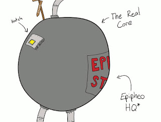
Epipheo Studios
Epipheo Studios have a truly inspired “About Us” page that is not afraid to show off their quirky & weird personality.
Cultured Code
Cultured Code, famous for their task management app “Things”, has
always been a company with a very professional image and meticulous
design, but with small hand-drawn elements to their site. The About Us
page is very much in keeping with this, with caricatures of each team
member helping to show off the team’s personalities while still
remaining professional.
Airbnb
Airbnb, this website that allows you to rent out your house easily, uses big & bold imagery to show you who the founders are.
GiftRocket
GiftRocket’s website has clearly been very thoughtfully designed and
has a very clear visual style – and this is also reflected in the “About
Us” page. The page reveals a bit more information on the founders and
the business, while looking great and fitting in with the site theme
perfectly.
Kyan
Kyan is a web design agency with a reasonably large team , but they
have taken the time to provide a bit of information on everyone along
with a carousel of the team to help prevent the agency from coming
across as just a faceless business.
6Wunderkinder
6Wunderkinder, makers of task management app Wunderlist, have always
put a great care and attention into the design of their site & apps,
and this is clearly true of the “About Us” page too. High quality
imagery and insights into the team help to make them seem more friendly
and approachable.
Bread & Pepper
Bread & Pepper is a software company that clearly has a sense
of humor. It is shown by the images of their team all obscured by their
MacBook Pro’s. A little bit of creativity & humor is a great way of
showing off the team’s quirky side, without necessarily being
unprofessional.
Lateral
Lateral have decided to inject some creativity into their “About Us”
page by having the snapshots of the team follow the mouse cursor around
the screen. Try pressing the arrow keys to make the team look in the that direction.
Bump
The guys at Bump have decided to make their About Us page a little
bit more interesting by including a big photo of them doing what they do
best – using their phones (and presumably using the Bump app) – instead
of facing the camera.
Fixel
Creative design agency Fixel use big, bold imagery to show off their
team – and also include sliders so that you can mix & match the
faces. It’s a fun and interesting display that shows that they are not
afraid to be a little bit different.
Are there any About Us pages that you think deserve a mention? Let us know in the comments.


